Most events produce a lot of energy.
People speak, share, debate, challenge, align, disagree, build, decide.
And then the event ends.
The room empties. The chat history gets buried. The sticky notes disappear. The action points become “someone will write them up.” And within a week, half the insight is lost.
This is where event visual summaries change everything.
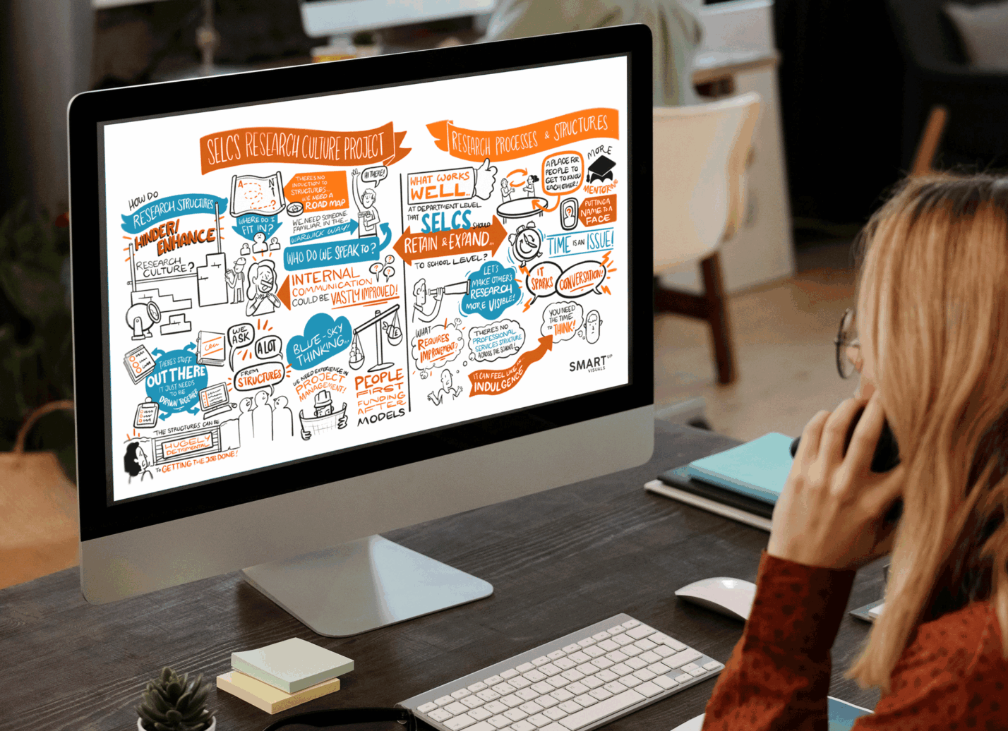
They turn live conversations into a clear visual record that people can actually use. Not just during the event, but long after it’s over.
If you’ve ever felt that your workshops and conferences create value in the moment but fade too quickly afterward, this is the missing layer.
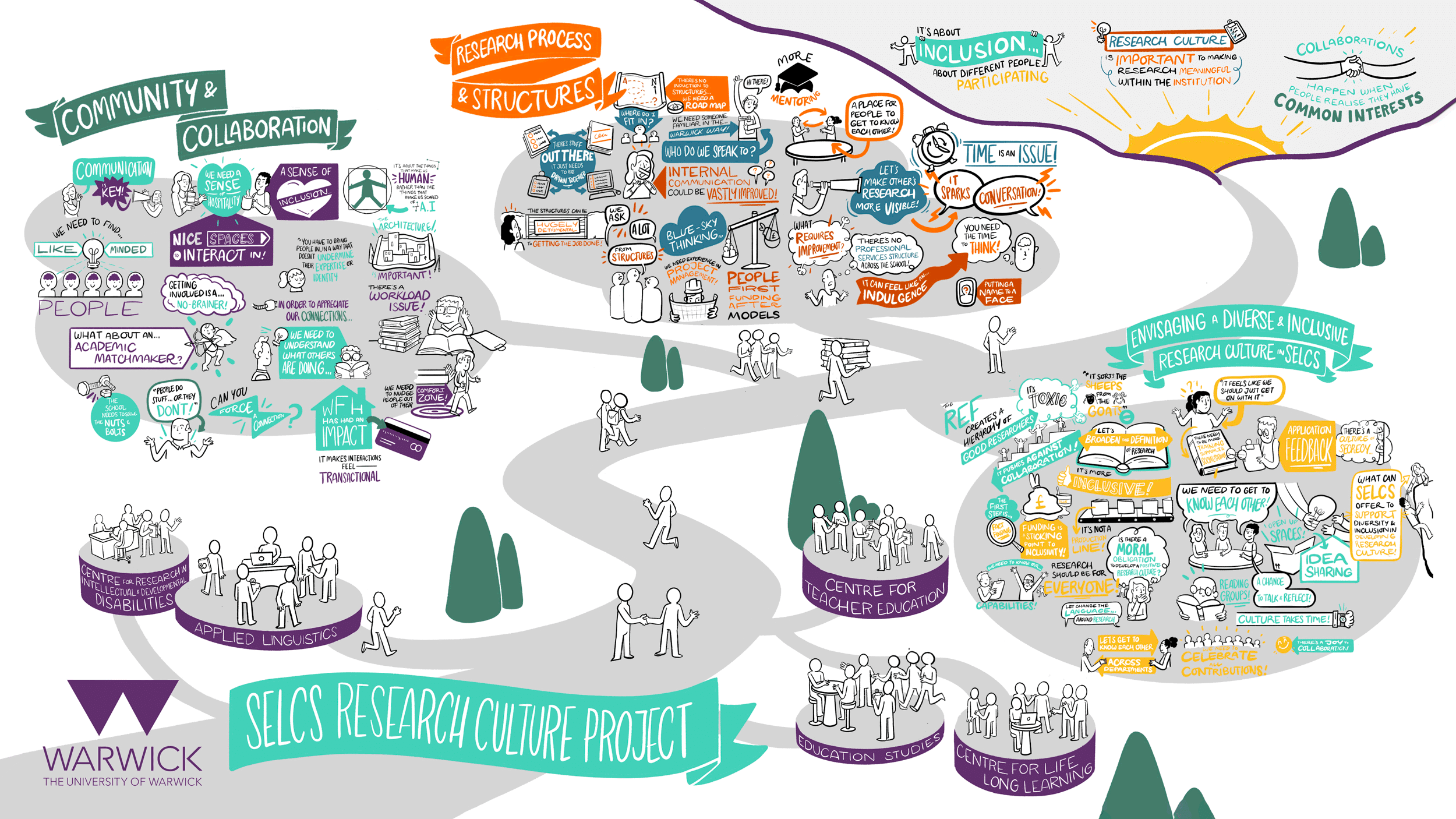
What are event visual summaries?
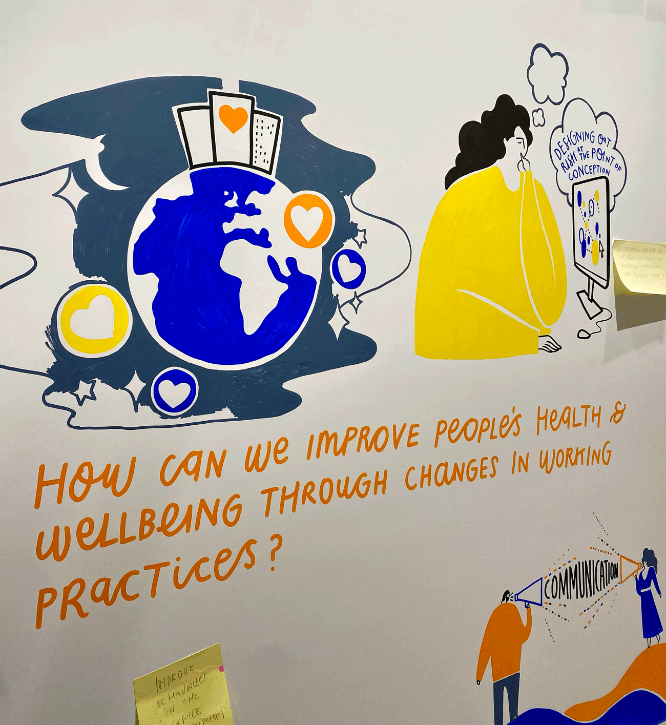
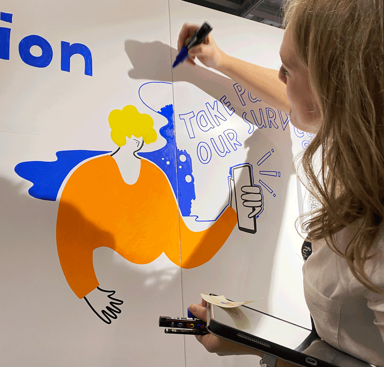
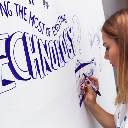
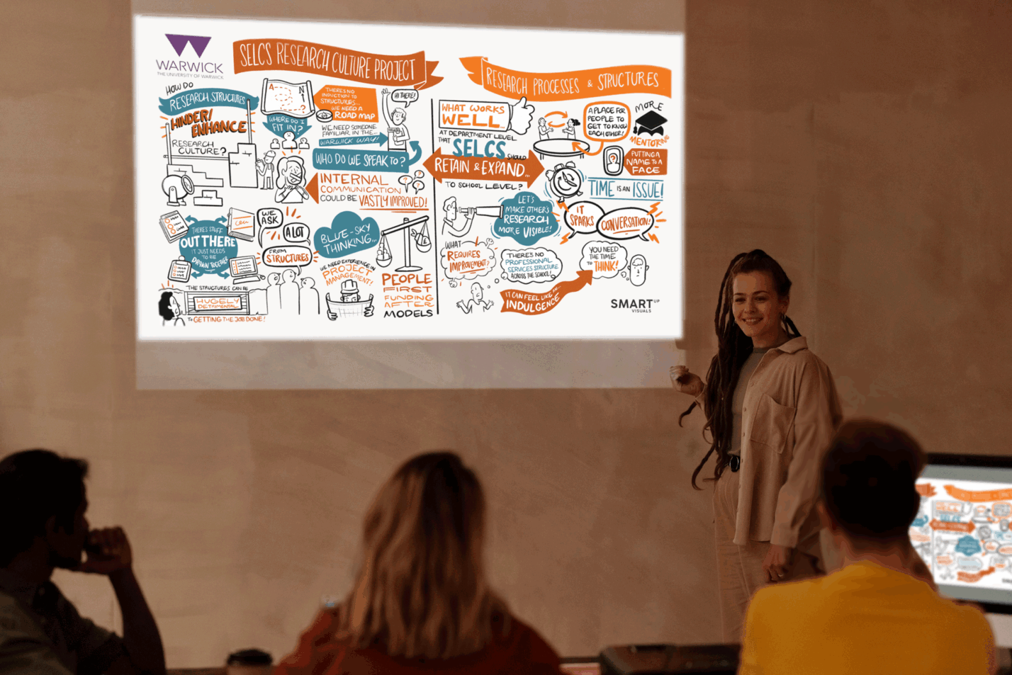
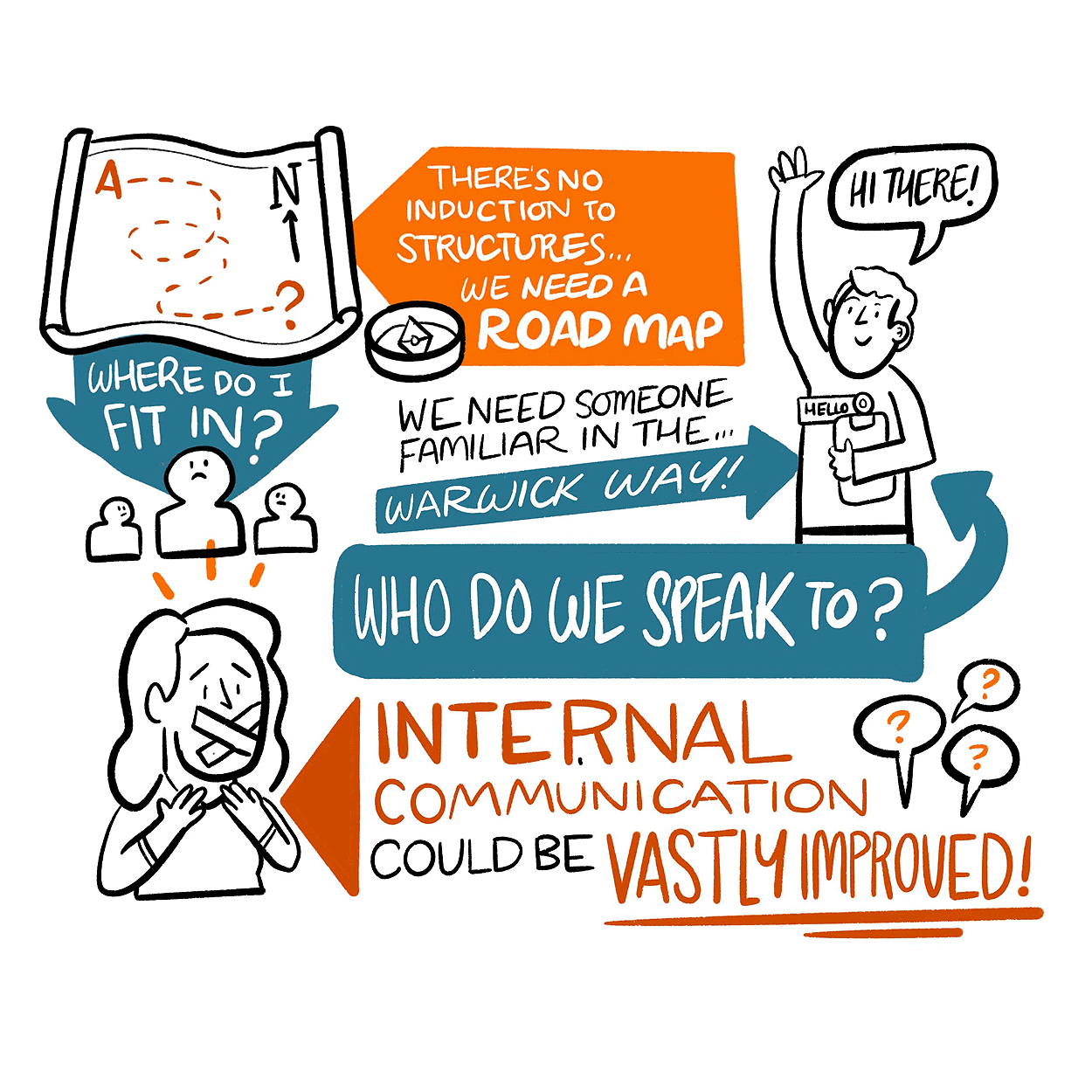
An event visual summary is a real-time visual capture of what’s being said and built during an event, translated into a structured, easy-to-understand visual.
It can include:
- key themes and insights
- decisions and priorities
- frameworks, models, and relationships
- audience questions and reflections
- actions, owners, and next steps
- strategic direction and shared language
This is not “illustration for decoration”.
This is visual documentation for events, built to support:
- clarity
- alignment
- memory retention
- internal communication
- next-step execution
Why event content gets lost (even in high-performing teams)
Even when people are engaged, the human brain can’t hold everything.
In strategic sessions, hybrid events, leadership workshops, and conferences, content is dense. Concepts overlap. People hear different things depending on their role. Attention shifts. Complexity builds.
Most organisations rely on:
- slides
- written notes
- recordings
- post-event summaries
But these rarely become shared reference points.
Written summaries are often too long. Recordings are rarely watched. Chat logs are impossible to scan. Slide decks capture what was planned, not what actually happened.
A visual summary sits in the sweet spot:
- fast to understand
- easy to share
- easy to remember
- easy to reuse
The business value: it’s not just engagement
A lot of people think the main benefit of live scribing is that it makes events more engaging.
That’s true, but it’s not the real reason leadership teams invest in it.
The bigger value is what happens after.
Event visual summaries create three outcomes:
1) Shared understanding
When teams leave a session with different interpretations, alignment breaks instantly.
A visual summary creates a single reference point that answers:
- What did we agree on?
- What matters most?
- What are we actually doing next?
2) Faster decision-making
Instead of revisiting the same discussion over and over, people can look at a clear visual snapshot and move forward.
This is especially useful in:
- leadership offsites
- strategy workshops
- change programmes
- transformation planning
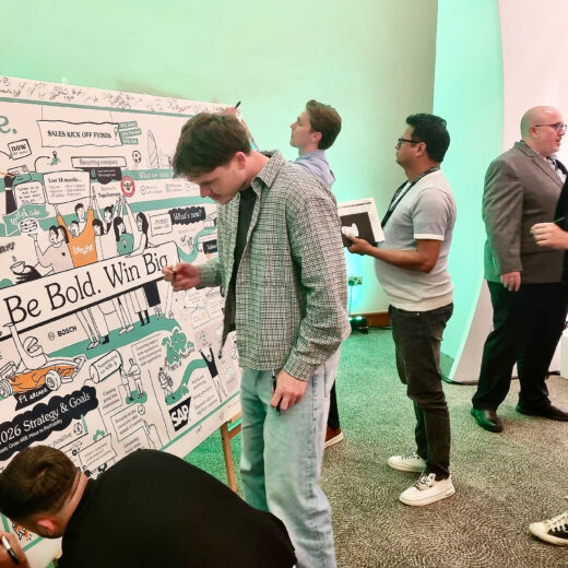
3) Reusable assets
A visual summary becomes a post-event asset that continues to work for you.
It can be repurposed into:
- internal communication visuals
- executive reporting
- onboarding materials
- stakeholder presentations
- campaign and event follow-up content
This is how one event becomes long-term momentum.

Where event visual summaries are most powerful
You don’t need them for every meeting. Here are the most common high-value scenarios:
Conferences and leadership events
When the goal is alignment, clarity, and strategic direction across teams.
Strategy sessions and workshops
When teams are building models, frameworks, roadmaps, or action plans.
Hybrid events
When remote participants need equal clarity and engagement, not just passive listening.
Multi-team programmes
When different departments need to stay aligned around the same narrative.
Change and transformation initiatives
When you need people to understand and repeat a message consistently

What makes a visual summary “strategic” (not just pretty)
Strategic visualisation is the difference between a drawing that looks good and a visual summary that helps people think, align, and act. A strategic event visual summary is built around:
- prioritisation (what matters most)
- relationships (how ideas connect)
- narrative flow (what leads to what)
- actionable clarity (what happens next)
A strong visual summary makes it obvious:
- what the story is
- where the tension or challenge sits
- what the organisation is deciding
- what needs follow-up
That’s why this is not just drawing.
It’s visual thinking in action.
What teams use event visuals for after the event
This is the part most organisations underestimate.
The visual becomes a communication engine.
Common post-event uses include:
Internal Communications
- leadership messages
- team newsletters
- internal updates and announcements
Strategy alignment
- board or exec updates
- roadmaps and next-step summaries
- cross-team alignment docs
Workstream execution
- action plans
- team ownership structures
- outcomes and responsibilities
Event follow-up
- “what we learned”
- recap posts
- post-event summary packs
Presentation reuse
- slides and reports
- stakeholder decks
- programme documentation
This is why event visual summaries are not “nice to have”.
They’re a practical tool for continuity.
Why visual summaries work better than text-based summaries
Text is linear.
Visuals are structured.
A visual lets you scan and understand in seconds:
- what’s important
- how things relate
- what happened in what order
This supports long-term memory because the brain remembers:
- shape
- hierarchy
- icons
- visual metaphors
- repeated patterns
This is why visual notes or inforgra for internal communication perform so well. People actually look at them.
How teams reuse event visual summaries
- internal comms recap
- leadership presentations
- stakeholder alignment
- onboarding + learning
- workshop follow-up packs
What to expect from a professional live scribing team
A high-quality live scribing process usually includes:
- preparation and alignment on event goals
- understanding of key themes and terminology
- real-time capture of conversation and outcomes
- refinement of the final visual summary
- delivery of shareable assets (digital versions + formats)
Depending on the event format, this can be delivered:
- in person
- digitally
- or for hybrid events
The difference is not just the method.
It’s the ability to translate complexity into clarity in the moment.
Who benefits most from event visual summaries
- event organisers and producers
- comms teams
- leadership teams
- transformation programmes
- L&D teams
In summary
Event visual summaries help organisations:
- capture strategic discussions as they happen
- improve alignment across stakeholders
- strengthen engagement and clarity during sessions
- create post-event assets for internal comms and reuse
- turn ideas into something teams can act on
When the content matters, a visual record protects value.
Because the most expensive part of any event is not the venue, the production, or the speaker.
It’s the insight that disappears after.
If you’re planning a conference, workshop, leadership event, or hybrid session and want your discussions to stay alive after the room clears, explore Live Scribing and how real-time visuals can support alignment, clarity, and follow-through.